|
|
注意,这个文章适用于拥有UTM里面那些光照和雾相关装饰物的图。
谢谢影子和头目解答了一些翻译中的问题。
图大的话可以下载下来看……
正好有现成的图,贴出来看看这个技巧可以做出什么样的地形:


这些都是用了这里面的光物件做出来的,当然主要还是别的东西……当然光很重要就是了


这是用了雾装饰物,当然有的是配合了光一起用的
Advanced Lighting
By ~Void~
http://www.wc3c.net/showthread.php?t=99116
1: Introduction
For those who don't know, the UTM stands for The Ultimate Terraining Map and can be found here喂,对于不知道的家伙们,UTM就是地形地图素材•究极型的意思。关于这个,你可以在传送门里面找到它。
Now, this tutorial is fairly advanced and you should probably have some basic knowledge of how to make your terrain look good already. If you are only just starting, you might want to read some other terrain tutorials first.而这玩意,完全地提升了你的水平而且让你可以拥有关于如果使你的地图地形看起来更好的相关基础。如果你是真正的菜鸟,你得先学些别的地形教材。
The basic concepts of this tutorial is to teach you how to use various lighting techniques (mainly the Light from Above doodad) to produce really high-quality cinematic screenshots. So let's begin.这玩意的基础思想就是告诉你如何使用各种照明技术(主要是装饰物的光照)来做出真正高品质的,电影般的地形截图。那么我们开始罢。
~-*~*-~
2: Sunlight
This section will teach you, step-by step, how to create sunlight, which can really help your terrain.这一节会一步步地告诉你如何创造一个日光,这玩意会让你的地形看起来更棒。
TIP: Light yellow and light blue/teal are good fog colors. And since lighting affects fog, don't set the end value too close or it will be too bright, and I recommend setting the start value at 0 so as to not have strange effects with the lighting.提示:浅黄、浅蓝(或湖蓝)是很棒的迷雾颜色。而且制造迷雾的时候,不要把最终值设得太近,不然会过于强烈。我建议设置开始值为0这样效果就不会太强。
Ok. So take your basic terrain, and put the editor in game-view mode (V) so you can see better what it will look like with the fog.好了。把你的地形拿来,然后在WE里面选中锁定游戏显示设置(查看=>锁定游戏显示设置,热键V)这样你就可以更好地看你的光照在迷雾里面的效果了。
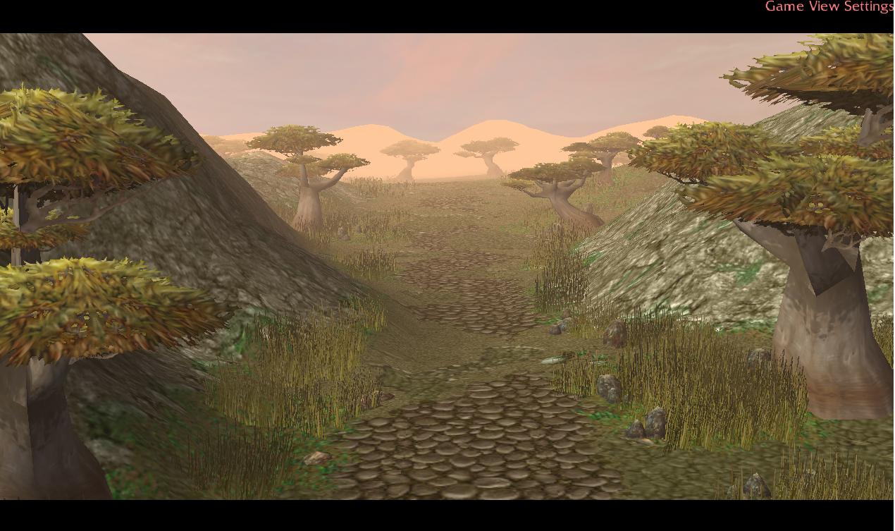
Go into object editor and find the Light from Above (angled) doodad. Set the maximum size to 100. Now before we place it in the editor, it would be wise to turn off random scaling and rotation so as to not get really extremely huge doodads. I only suggest 100 so you can change it to anything you want.进入物体编辑器并在装饰物面板找到Light from Above (angled)(在UTM的自定义装饰物的电影里面),把最大比例设为100。在我们把它丢进编辑器之前,应该关掉可以放置随机比例和旋转,这样我们才不会得到过于巨大的装饰物。我的建议是100,你可以自己随便改。
Now, place one or two (maybe 3 if it's still not bright enough) lights right in front of the camera, and size them up to 200%-400% (maybe make one 300 and one 400, to have variation). And there you have it, your terrain already looks a bit better.现在,在镜头前放置1到2个(如果不够亮的话就3个)Light并使它们的大小从200%到400%(也许可以弄一个300的,一个400的,制造变化)。现在你有了光照,你的地形看起来就好些了。
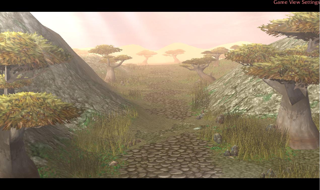
TIP: If your light is too bright try tinting it down to 150/150/150 or even as low as 50/50/50, it won't make things darker it will just make the light more transparent.提示:如果你的光太亮了那就试着把颜色调低到150/150/150甚至50/50/50这样低的数值。这样并不会让地图看起来比原来暗,它只会让光线看起来比较透明清楚。
TIP: If you see an ugly glow at the bottom of your light, try lowering it a bit and it should go away. The brighter you want the light to be, just lower it, because the brightest part is at the top. Or you could just make it short and fat for a gradient effect. There's a lot of things you can play around with to make great and original terrains.提示:如果你看到底部不堪入目的那堆光,试着把它的位置调低一点儿。需要更亮的的话那就同样把它调低点,因为它最亮的部分是顶部。你也可以试着把它弄得矮胖一点来弄出个渐变效果。有很多玩意儿你可以用来制作一个一级棒的原创地形。
~-*~*-~
3: The Sun Itself
Now this is a somewhat tricky one, and it may take a while to get it to look right, but be patient, it will pay off in the end!这个就是比较有技巧性的啦,而且需要反复测试之类的来让它看起来比较正常。但是耐心点,最后你都会得到很棒的回报的!
Ok, so first go into the object editor again and find Light from Above doodad (not the angled one this time) and go under Art - Maximum Pitch Angle, and shift-double click that (to allow negatives) and put in -1.57. This will tilt your Light from Above doodads so that they aren't from above anymore, more from the side :) 在物体编辑器的装饰物面板里找到Light from Above(这次可不是angled的)然后到X轴旋转角度那儿用Shift大法输入-1.57。这样可以使你的光有些倾斜,从边上打来,而不是从上面。
You should end up with something like this when you put it in the editor.当你把这玩意放进去的时候,你的地形应该是变成这样的状态。
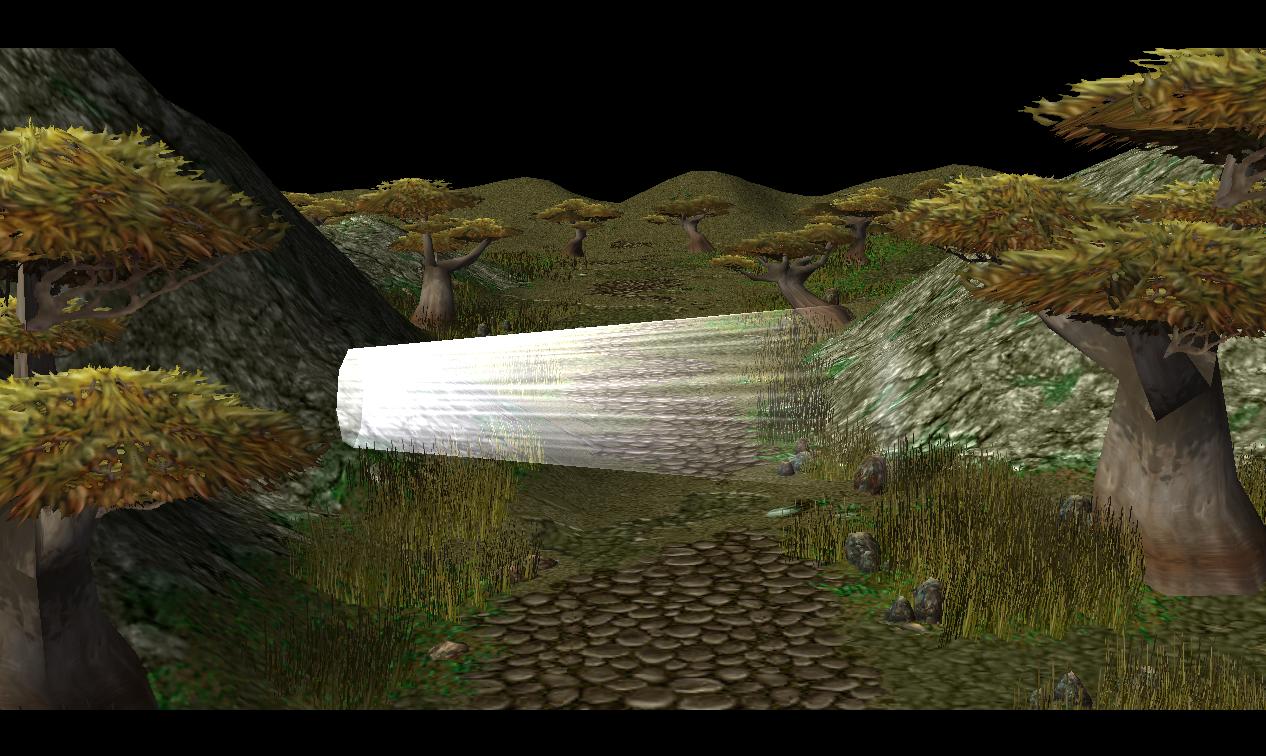
Now how does that look like the sun? Well, it doesn't. You have do do some stuff first. First, select the light doodad you just placed and rotate it so the thin part is pointing away from you (and the fat one pointing towards you, should be 90 degrees if you are at the default camera rotation). Then, move it towards the way back of your terrain, on the horizon, and lift it up a bit. You might want to be careful where the height is where you put it, though (preferably a flat part behind the horizon) because it will rotate a bit from the pitch angle you did in the first step.但是这玩意看起来像太阳的效果嘛?hmmm,悲剧啊。你还得做点别的。首先,确定好你放置的光源的角度使得较细的部分在远处对着你(如果在默认视角下,较粗的部分应该呈90度对着你)。然后把它朝着远处移动到地平线,再举起一点点。你也许会对它的高度设置非常小心,因为你在第一步设置的X轴会有一些转动。最好有一点在地平线后面。
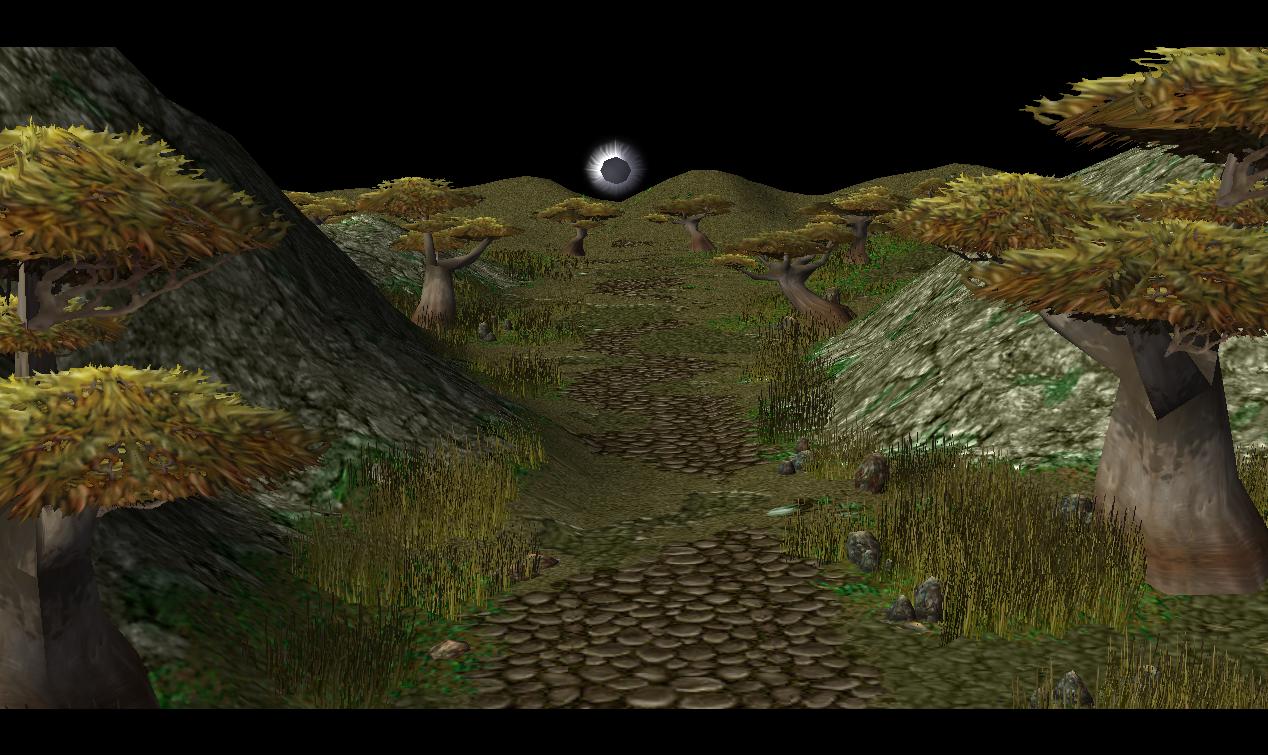
Congratulations, you've got this far... now for the "fun" part :\恭喜恭喜,你现在有了一个远处的……恩,事实上是有趣的东西。
Size the doodad to about 1000%. I don't recommend going larger than 1500% or smaller than 750%.把装饰物的尺寸设置到10倍的样子。我不建议大于1500%或小于750%。
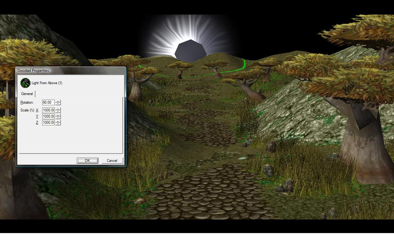
OMG, what about that big hole in the middle of the sun? Don't fret, you can just cover it up with fog doodads! Go into object editor, and find the doodad Fog (edit in object editor). Make the max size of this 100, although I doubt you will need to resize it. Maybe set the tint to that of your fog plus or minus a bit. Then, just spam about 10 of them over the hole in your sun. Hooray, it's fixed, thank you Fog Doodad!哎呀呀,那这个太阳中间的大洞怎么办呢?别担心,这个问题蓝猫我知道,你可以用素材图里面的雾装饰物盖住!到物体编辑器里面找到装饰物Fog (edit in object editor),把最大比例设置到100(虽然我会怀疑你需要重新设置)。然后也许要把雾的颜色设深点或者浅一些。然后弄10个左右来遮住你太阳上的洞。万岁!完美了,太感谢你了~装饰雾娘!
You now have an awesome looking sun!你的太阳现在看起来就很赞了!
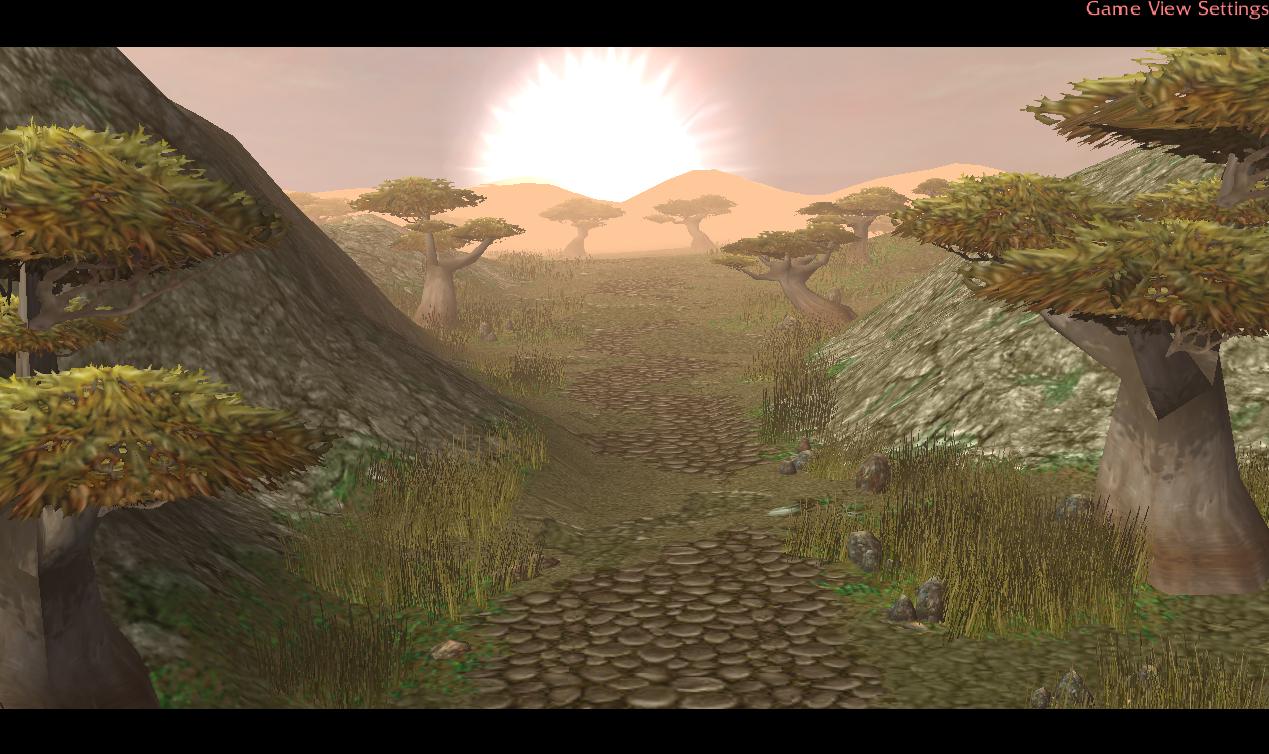
TIP: The sun used in my terrain, Dawn was made with two light doodads, one slightly more transparent and bigger than the other (to get extra-long rays)提示:如果你想要用这个太阳作出一个黎明的效果,弄两个光源,一个要比另一个大很多这样才可以用更远的光线。
~-*~*-~
And, that's all for now. I hope you all enjoyed my tutorial and learned a lot from it, and I will be back with more tips on lighting as my own knowledge on the subject progresses.
Happy Terraining,
~Void~ |
评分
-
查看全部评分
|